 Some interesting news in a recent slide we got during an Auckland Transport presentation.
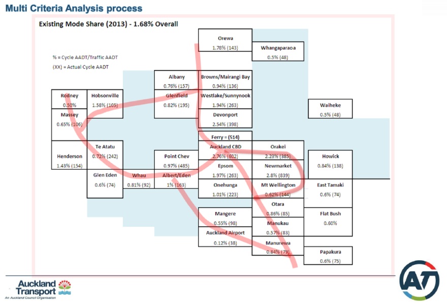
Based on their survey data (we believe this is a combination of cycle counter and manual survey data), AT have done an estimate of the cycle mode share across Auckland. We cannot speak to the details as to how they produced the map (that wasn’t discussed in the presentation), but it provides some highly interesting information about the where & how much of cycling in Auckland.
Some of this certainly clearly correlates to “felt cycle mode share”. I.e. while Copenhagen laughs at these numbers, it certainly feels that the CBD area has a much more substantial cycle mode share these days than other places – or than the CBD from a few years ago.
It will be interesting to get the Census “journey to work” results soon. Those will be another 1-day snapshot, but will be particularly useful for the “where do people cycle more/less” question, which this map shows.